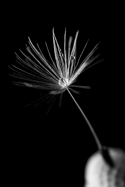
Fine line botanical
Clean line hierarchy with protected negative space. Designed to stay readable at the chosen size without relying on fragile micro-detail.
A curated selection of recent work photographed for line clarity, value structure, and healed-readability. Every piece starts with a brief, then a design built for placement and scale.
If you want a similar direction, mention the style and placement in your message. We’ll match you with the right artist.
Tattoo photos can be misleading if they’re over-processed. This gallery prioritizes straightforward lighting and composition so you can judge line weight, contrast, and edge control. When you see large areas of negative space, that’s intentional: breathing room keeps a design readable as it settles.
You’ll also notice a mix of piece densities. Fine line relies on disciplined restraint and consistent pressure. Blackwork relies on even saturation and a clean value ladder. Color work is about packing and palette choices that don’t turn muddy. Cover-ups are about realism: strong silhouettes, deliberate contrast, and a plan that accounts for what’s already there.
If you have a direction in mind, the fastest path is to describe (1) placement, (2) approximate size in centimeters, (3) style references in words, and (4) any constraints. We can build a brief from that, then propose a session plan.
Look for consistent thickness, stable curves, and clean ends at intersections.
Contrast and spacing are what keep a tattoo readable at arm’s length.
Selected pieces across styles. If you’d like a direction like one of these, mention it in your request and we’ll suggest an artist and a realistic time estimate.
Clean line hierarchy with protected negative space. Designed to stay readable at the chosen size without relying on fragile micro-detail.

Bold shapes and even saturation. The value structure is built for distance readability and long-term clarity.

Saturated packing with calmer transitions. Palette choices are picked to age without turning dull or muddy.

A drawing-first approach that balances texture with negative space. Edges stay crisp, and shading supports the form rather than crowding it.
Planned around opacity and a clear value ladder. The goal is a new piece that reads as intentional, not as a patch.
Placement is part of the design. We validate alignment from multiple angles before tattooing to protect flow and proportion.
Share placement, approximate size, and the style direction you want. We’ll reply within 1 business day with consultation details, a time estimate, and a pricing range. If you have reference images, describe them here; you can share files after we reply by email.
Tell us the placement, size, and the style you’re referencing. We’ll reply with a clear consultation plan and a quote range based on realistic session timing.